Product Design
Mobbi App | Web/ App

TL;DR
My goal as a product designer is to select and implement the best methodologies to ensure an excellent end result.
- My Role
- Product Design
- Duration
- 3 months
- Tools
- Figma
- 01
Context
Mobbi is a delivery app for restaurants and stores in general. Its function is to make quick and easy purchases of products from any category.
- 02
Goal
Small businesses may create their own stores using the app. Users will be able to purchase products from several categories directly through the app.
- 03
Solution
The app will have a home page dedicated to nearby stores, as well as store categories. Aside from the ability to purchase personalized products, users will be able to order food, objects, and even services through a single app.
01
The Challenge
The project's primary goal was to establish a completely new application for customers and merchants where users could easily and quickly buy and sell things. Mobbi once functioned as a delivery application in Rio de Janeiro, allowing users to order small freight for delivery inside the city. The goal was to make something larger and more complex. The goal was to reach out to small company owners.
02
First Attempts
To identify the project's personas, I initially conducted qualitative and quantitative research with previous and prospective consumers. In addition, we performed a software investigation to identify technical issues that may limit the introduction of additional features.
03
Clients view
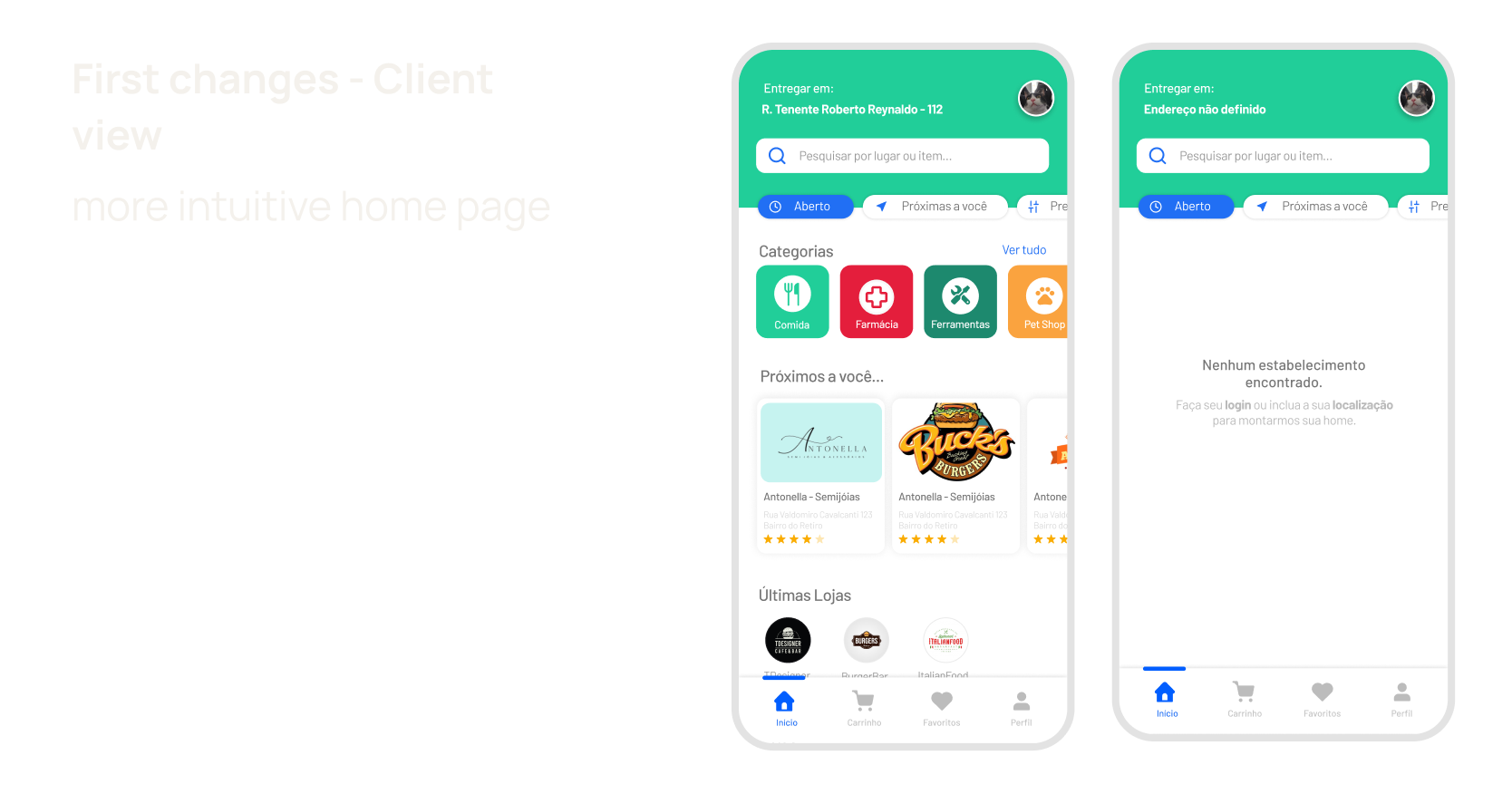
We had a limited amount of time and wanted to provide the first screen as soon as possible. Initially, we discovered a need for additional information about what the app did and what previous users expected it to do throughout our study with regular users. They were:
- 01
Small product delivery system
- 02
Purchase goods other than food, such as ifood.
- 03
Purchase more than one product at the same time.
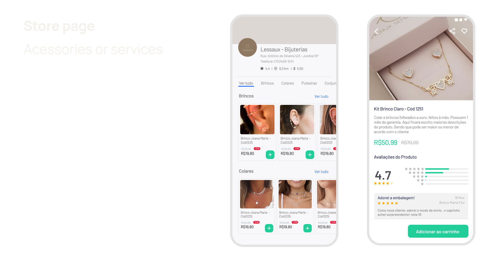
We included a virtual product display, which might be useful for selling many categories in a single store.
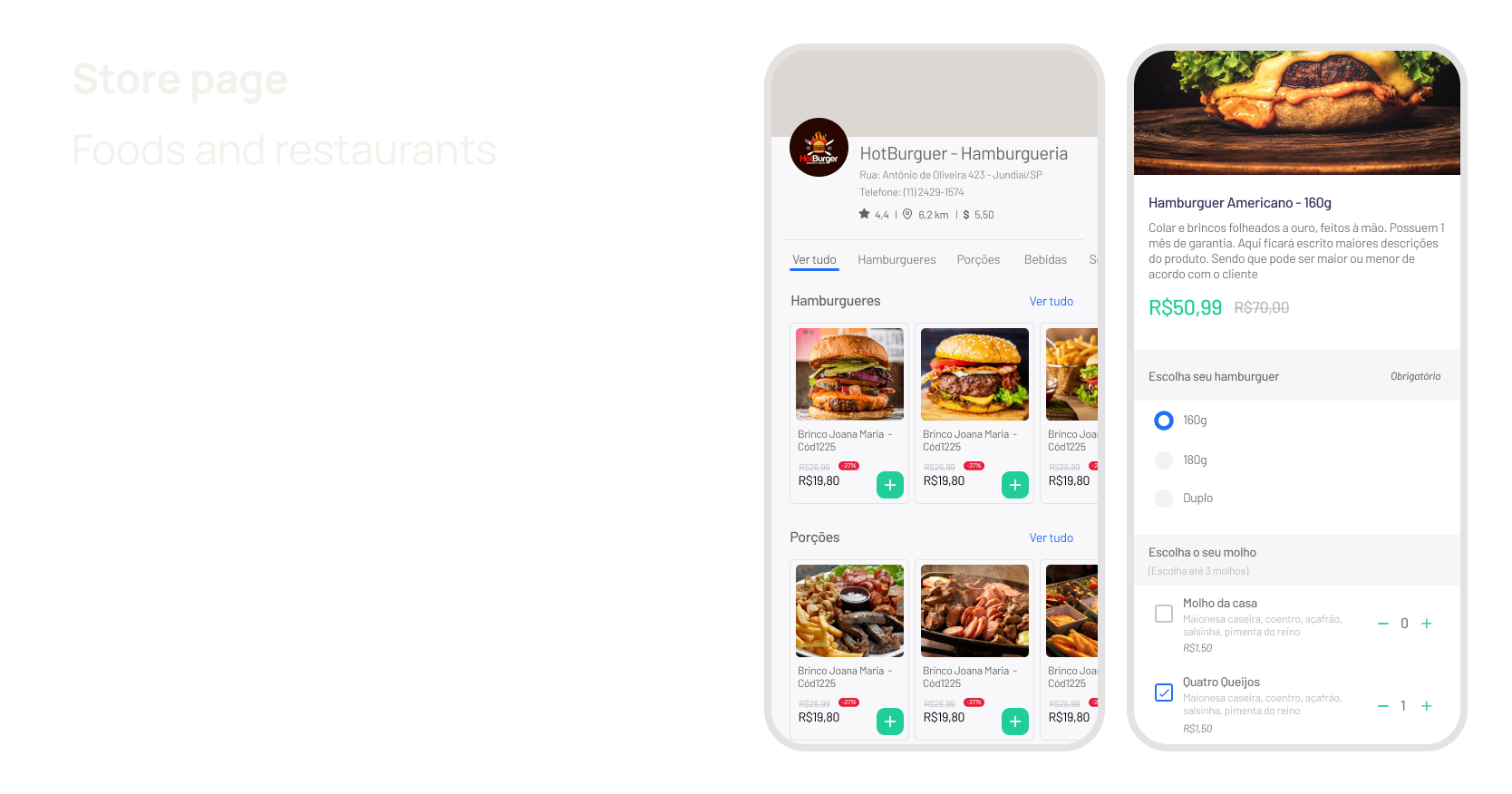
We made a different version for stores that sell foods and require subcategories for additions.
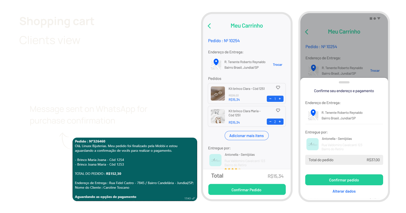
The shopping cart had a high volume of transactions, and users disliked having to log in to the app to track orders. The small business owners mentioned that some customers still reached them directly via WhatsApp, and that having two platforms running was too much. So, thinking about our users' needs, we decided to stick with the quick purchase, which benefited both parties. The user selected all of the items directly through the app, completed the purchase, and then a message with all of the information was sent to the company via WhatsApp, where it was finished.
Following tests, this was the preferred method among consumers and small business owners.
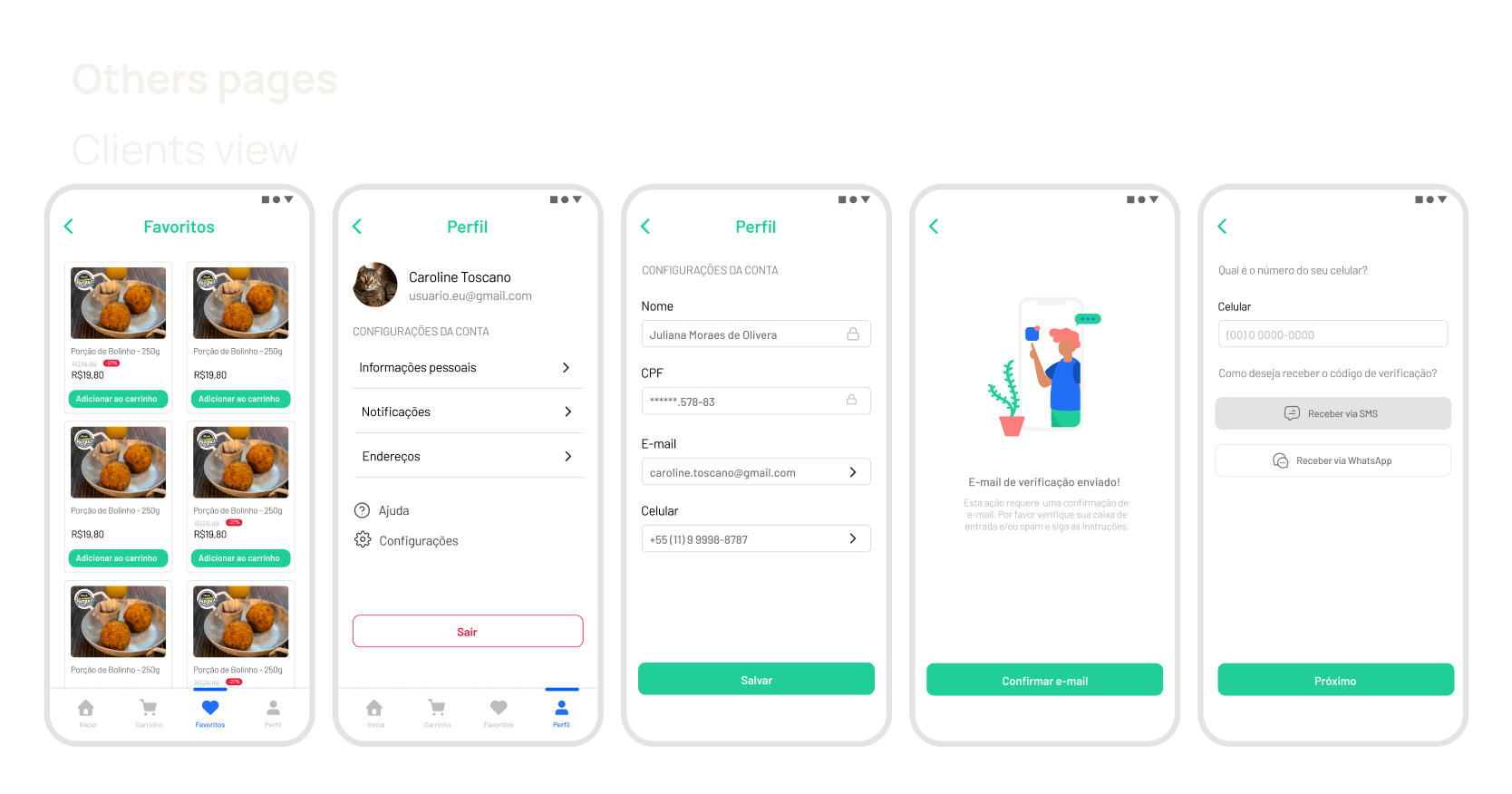
Below are some screens that we also changed, including the favorite screen, the profile, some pages with illustrations to make them more appealing, and SMS account configurations.
04
Business view
After completing all of the purchasing flows destined for buyers, we began the creation of the selling flows destined for small business owners.
Our goal was to make product publication more accessible, because the target audience ranged in age from 40 to 65 years old and had difficulty publishing their products on other apps.
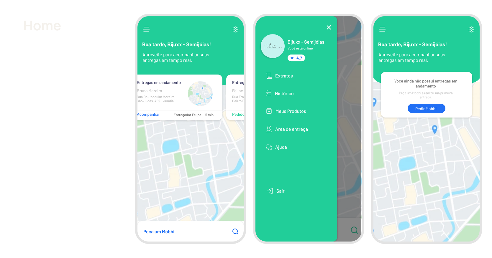
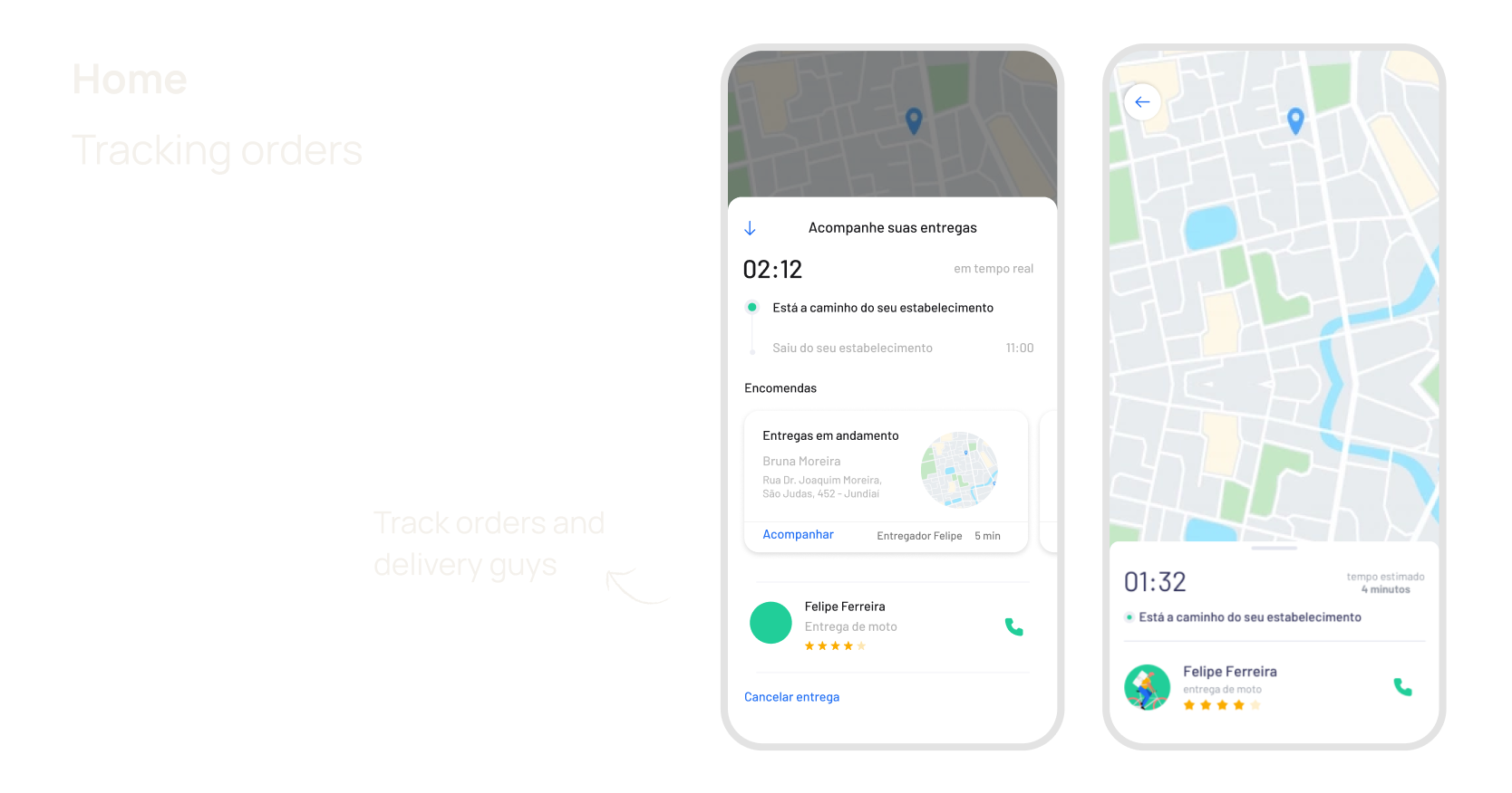
We've created a homepage for businesses, along with vital information collected through research. As an example, you may track the status of two orders that are in transit, who is in charge of the order, and how many deliveries are being made by the same person.
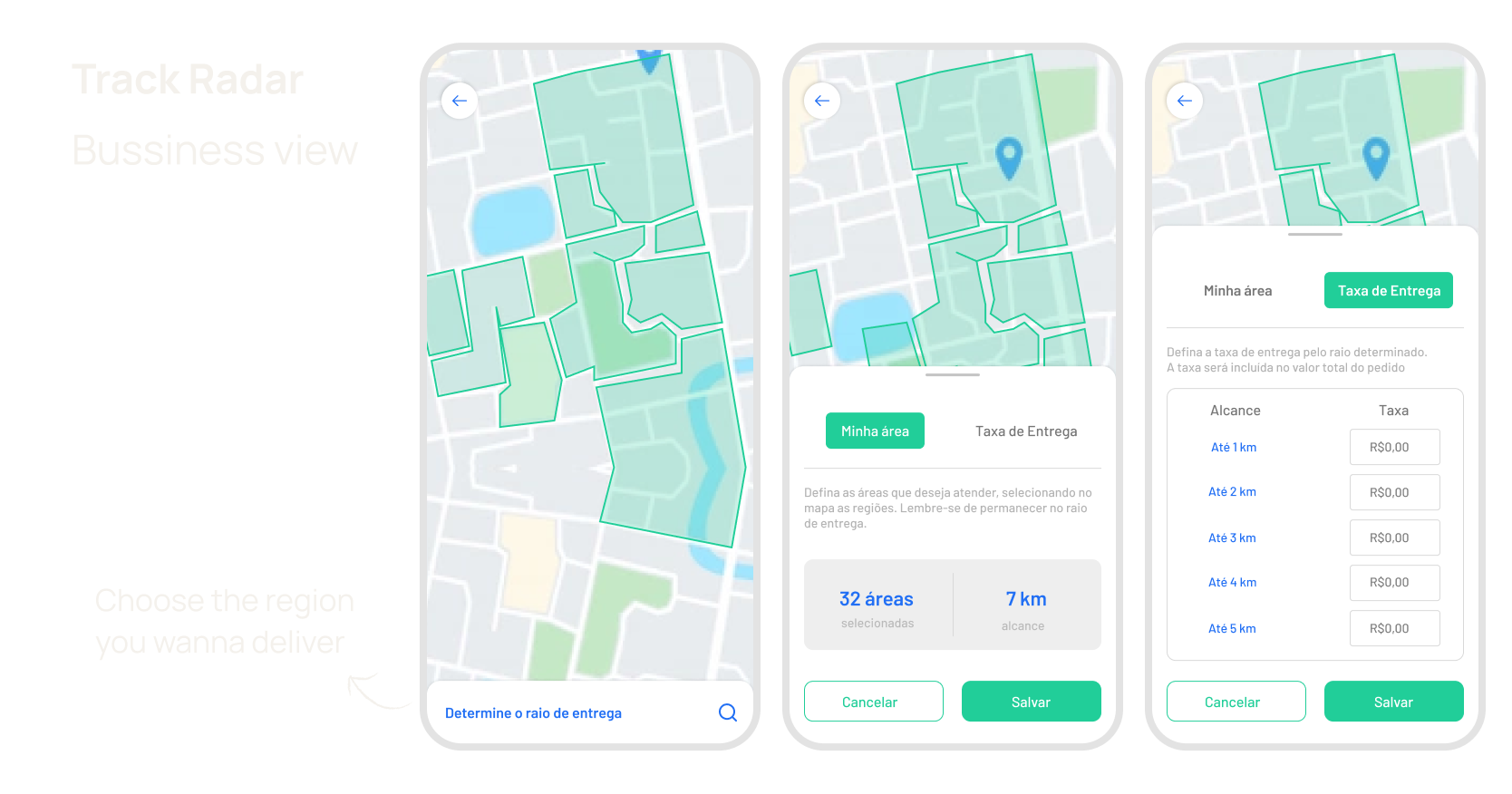
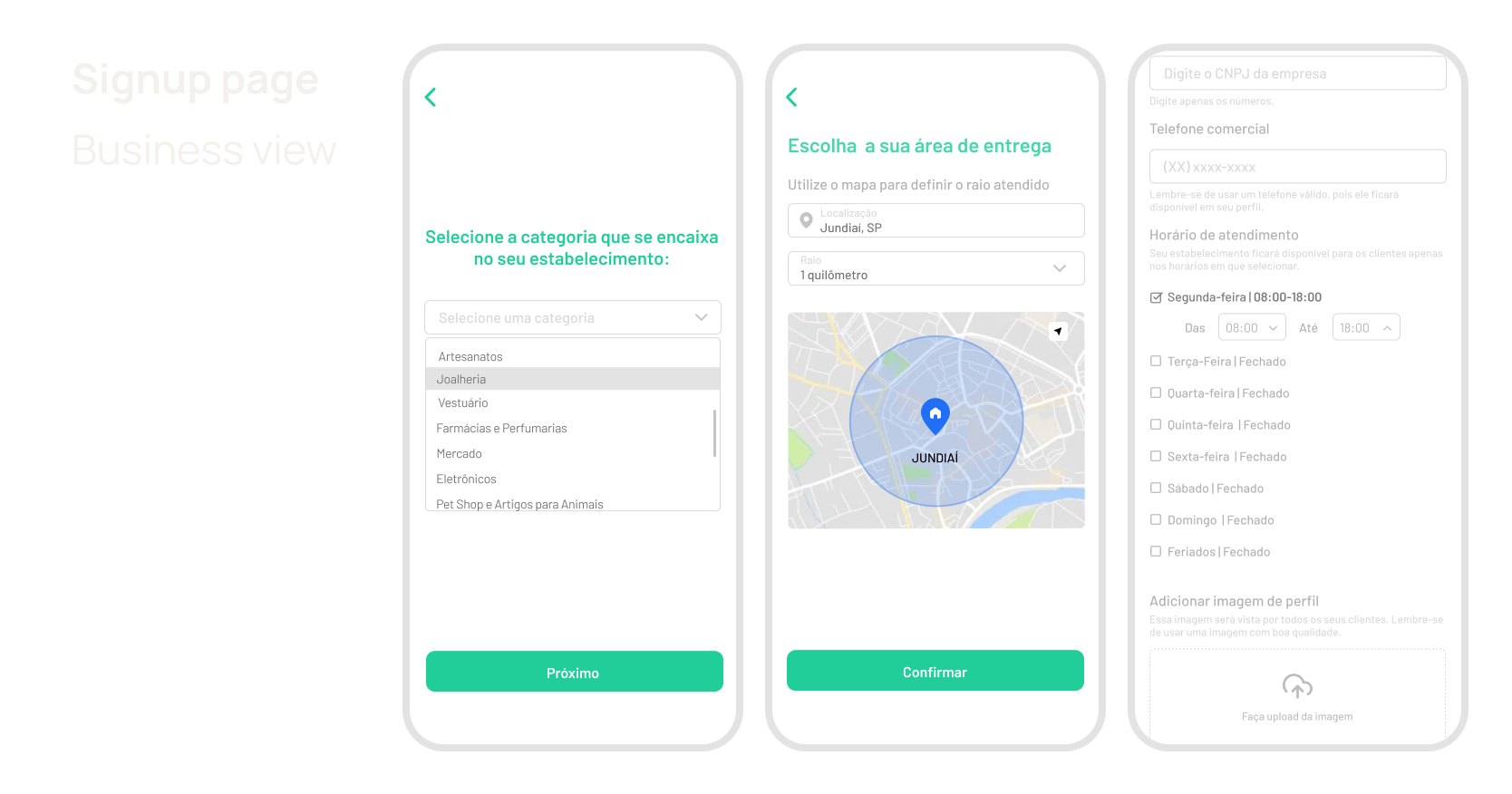
We discovered another need in qualitative research for merchants to be able to choose the range and areas that they would want to deliver. With that in mind, we ran all of the usability testing and came up with this final prototype.
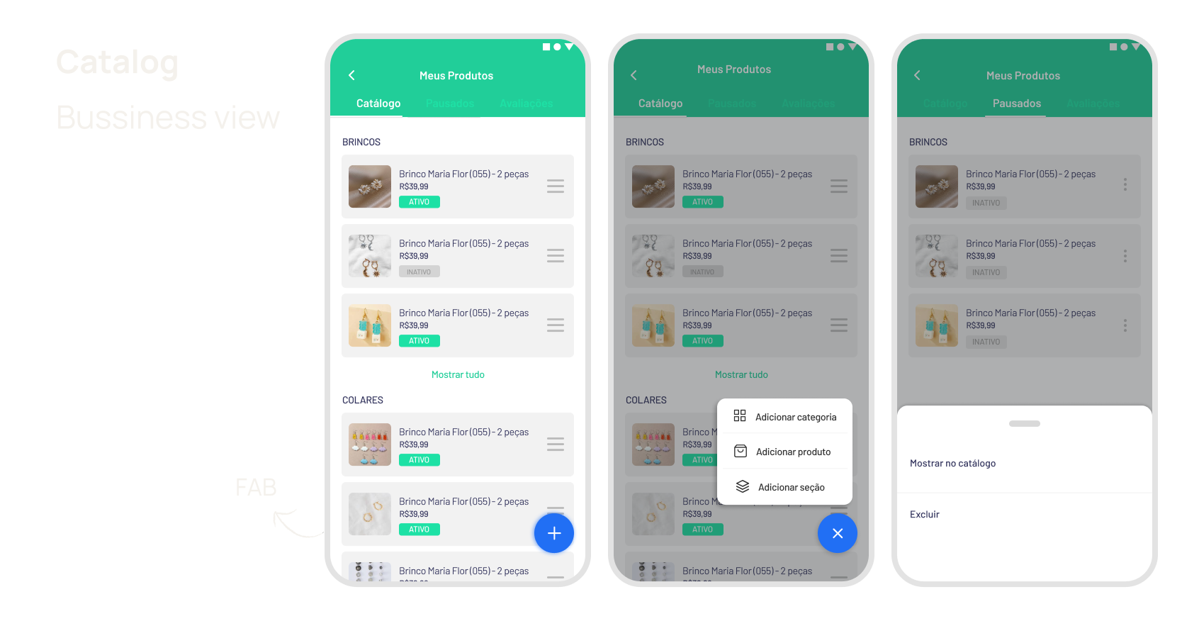
On the product page, we choose to categorize everything and make it easier to add products using an FAB. We believe that this option made all of the major options more accessible and visible through usability testing. None of the other options for locating the add button had the same impact as the FAB.
We also made changes to the signup page, where business users had to provide their working time, shipping address, and company logo... Previously, these details were requested when entering the app, but we discovered that no user completed them when they were able to log in directly to the app. Following the tests, we saw an increase in the number of users with complete information.
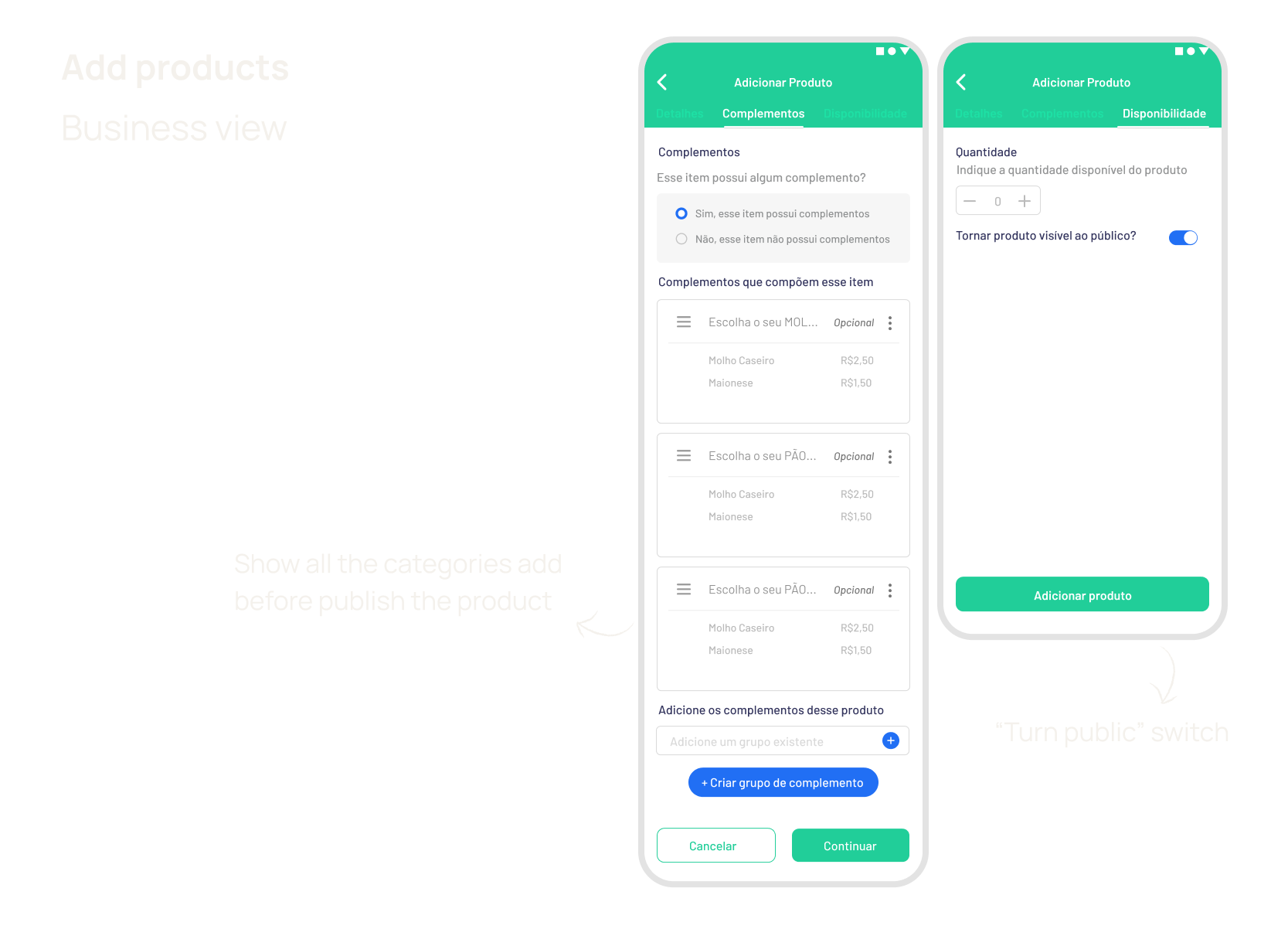
The flow of product addition was another thing we worked hard to make practical and quick. We added the option to add categories, and after adding all of the extras, add-ons, and subcategories, the user was taken to a double confirmation screen with everything he had previously selected, to avoid postage errors of incomplete or missing products. We also included a button to determine if the product is visible or not. Some users expressed a desire to be able to remove the product without having to remove them, only in cases of product shortage or company shutdown.
05
Website Landing Page

06
Results
We arrived at the final prototype after all of the testing and research, and once it was released, we had excellent user approval. It is still in beta and is only available in Rio de Janeiro.
More projects