Product Design and Growth
Gamers Club

TL;DR
My goal as a product designer is to select and implement the best methodologies to ensure an excellent end result.
- My Role
- Product Design
- Duration
- 11 months
- Tools
- Figma, Adobe Photoshoop and Illustrator
- 01
Context
Gamers Club is a game company focused on the CSGO experience which is expanding through a paid subscription and official brand rewards.
- 02
Goal
Improve the experience of subscription, downgrade, and management. Also increased retention of free users to premium users.
- 03
Solution
Redesign the Upgrade page, improve and reduce downgrade rates, and expand the information available in "Minha conta" so that users may take control of their accounts.
01
About the company
Gamers Club is plataform for Competitive CS:GO with the intention of transforming competitive online gaming. I work in the Growth team focused on subscriptions, retention, increase the rate of customer acquisition and revenue by optimizing products and inventing new marketing channels.
02
Challenges
During my nearly one year at GC, my position was entirely focused on Growth, which includes subscription plans, downgrades, cancellations, and account management. Initially, we prioritized the subscription plan, which had an outdated Design system, with an old design and minimal information, not providing the subscriber with its true value. We concluded after a few months that just changing the plan page was insufficient if the user had no way of controlling recurring payments, changing plan details, or completing a simple downgrade. Follow my procedure step by step.
03
Subscription Page
When we examined the previous page, we discovered that, in addition to usability issues, there was limited information to encourage the user to subscribe to a recurrent plan. With this in mind, we expanded and improved the page. We didn't observe any issues while scrolling across the site; however, without information, users lost interest in the page. To make it more appealing and intuitive, we provide information on each feature available in the PLUS and PREMIUM plans, as well as illustrations and colors. We also include a basic FAQ with frequently asked questions from the Customer Service and Experience team at the bottom of the page.
We adjusted the contrast on the page since we recognized it was inaccessible to our colorblind users. With this in mind, we made the backdrop of the benefits a contrasting color so that people could see how much and which benefits were included. Some people with this condition have been confused by the green and red colors.
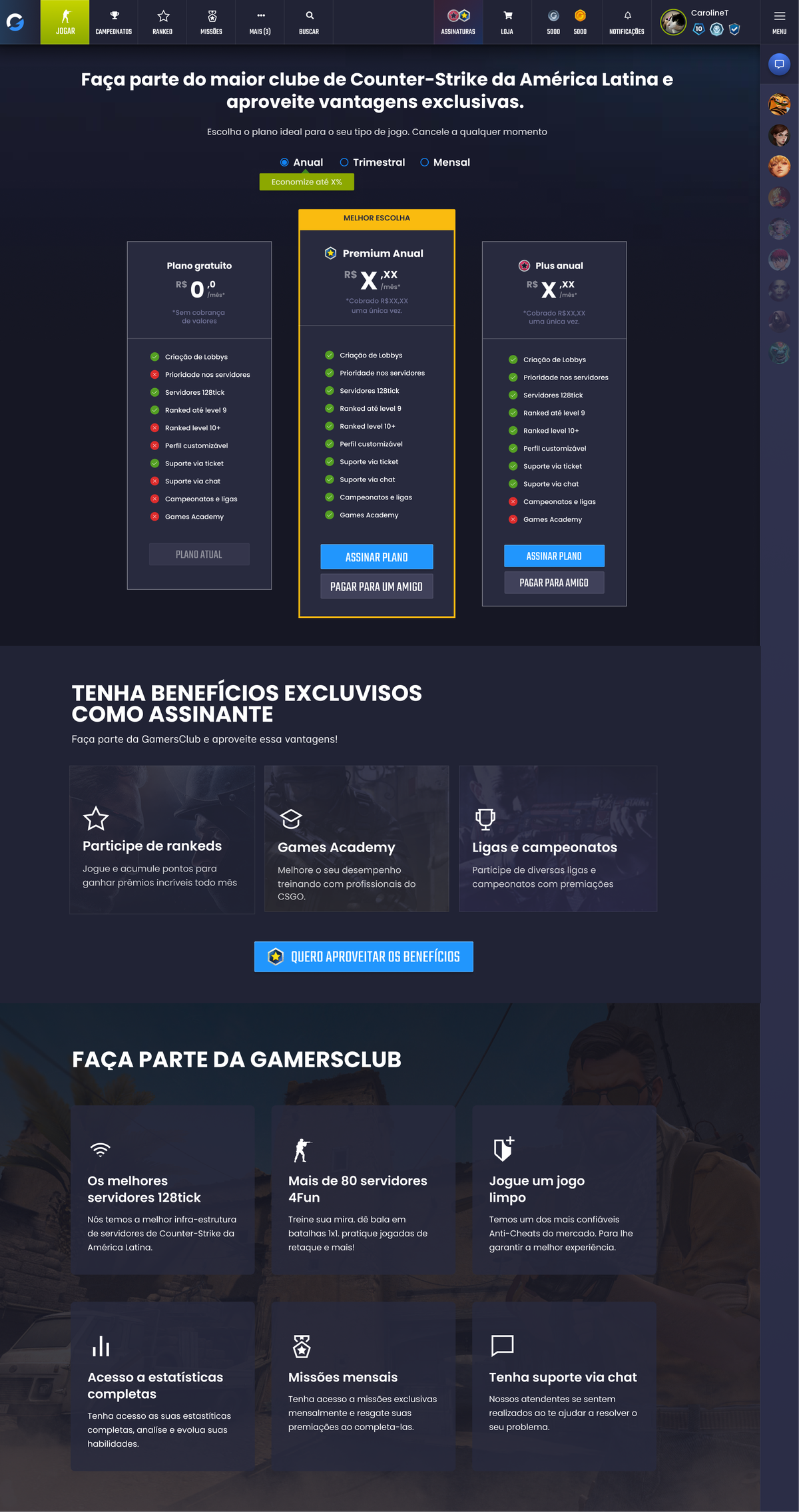
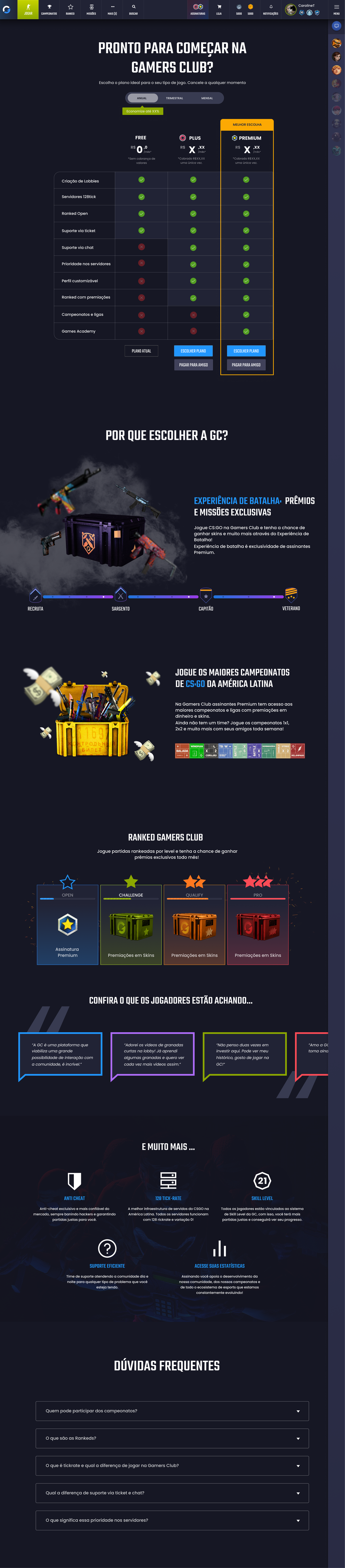
We also created futre sale pages for events.

04
Results
Increasing the number of interactions on the page, as well as the number of signatures, in a short period of time. The entire page was being engaged with by users. We made the following decisions: Reduce the size of the page to make it more compact.

05
My Account
After completing the plan page, we went on to the user's account and subscription. Previously, the user had no sufficient information about his plan to manage it effectively. Even the membership cancellation step involved multiple phases, which frustrated the user, and as a result, the unhappy user did not subscribe to Gamers Club again.
We've included a lot of information that wasn't on the previous page, such as the active plan and several upgrade/downgrade triggers that should have been shown on that page. We've included plan activation and expiration dates, as well as payment details, so users may check in anytime they choose.

We changed the menu from - Receipts to - Purchase historic and receipts. Previously, this session did not provide information on what was charged or how much was paid. We include colors to refer to PAID, CANCELED, and PENDING purchases, as well as the date, the name of the transaction, and the amount.

We had to adjust several payment methods since they were interfering with the buying flow of the plans. We removed all irrelevant information and kept only information regarding prices and recurrence.

06
Cancel Flow
After finishing the subscription page and "my account," we began making improvements to the cancellation flow. Previously, the cancellation procedure ran through several stages before becoming completed, and many users were so frustrated that they contacted CX to cancel via chat. As a result, we decided to simplify the flow and update some details in order to facilitate the cancellation flow.
One thing I've learned over time from talking to users is that they will all find a way to leave your product anytime they want, and it's our responsibility to enable that so that, while leaving, your user also has a nice impression.

We limited the cancellation flow to three steps. (4 steps if upgrading/downgrading while cancellation). We made the procedure fluid and fast so that we might obtain feedback at the end. As a result, the user can quit whenever he wants, knowing that we would offer him to the same experience as when he first signed up. Happy users come back

07
Results
With all the changes made so far, we have had a significant improvement in the usability and accessibility of the platform and consequently attracting more paying users. The company is still undergoing constant improvement, and I am happy to have been part of something so important in the lives of our players.
More projects