Financial wellness platform redesign and AI integration
Origin Product Design and AI
At Origin, my primary goal was to develop a new design system and enhance the overall user experience within the app. I also contributed actively to implementing AI as a new feature across both the app and the website.
Product Design, Design System and AI
TL;DR
Origin is a company dedicated to simplifying complex financial operations for personal finance users in the U.S., centralizing all financial tools and services in a single, seamless platform. The mission is to empower users to manage their finances more efficiently, with transparency and ease.
- My Role
- Product Design
- Duration
- 1 year
- Tools
- Figma, Adobe Photoshop, Maze
- 01
Context
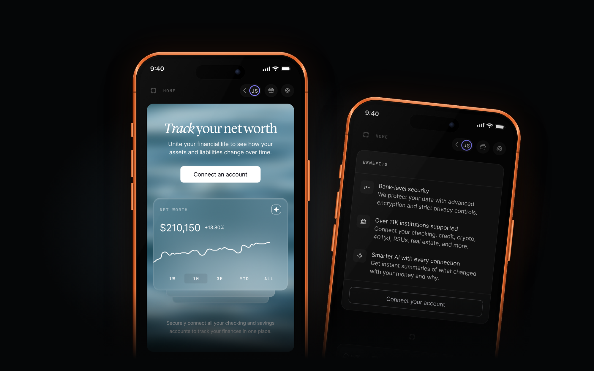
The project began by first improving our design system, creating consistent components and structures across the entire app. We then moved on to the redesign, updating the brand, integrating AI, and implementing motion design to capture users’ attention and simplify their actions through artificial intelligence.
- 02
Goal
Our goal was to position Origin as the first fully-featured financial app on the market, offering AI-powered functionalities designed to simplify users’ personal finance management and make their financial lives easier.
- 03
Solution
Our solution went far beyond designing visually appealing screens. Origin is an incredibly complex company, with integrations across multiple U.S. banks and a unique personal finance management system. Improving usability across the app and website was the first step toward implementing a more advanced AI system within the app.
In addition to actively leveraging the design system, we created simple, intuitive experiences that enable users to achieve their financial goals and plan ahead with the support of AI.
01
Design System and Research
One of the key initiatives at Origin was the creation of a comprehensive design system capable of supporting not only the end users but also business clients, the back office, and other company products. By developing our internal Design System, we improved the efficiency of screen creation, addressed usability challenges, and made the implementation of complex components much smoother.
Built completely from scratch, the Design System was structured to ensure consistency across the app. With a well-organized component library, clear guidelines, and standardized patterns, we transformed the previous outdated and inconsistent interface into a modern, cohesive experience. Thoughtful motion design further enhanced the user experience and visual impact.

02
System Foundations
40+
components, developed in both Figma and React
AA
WCAG 2.2 AA standards by default
The Origin Design System provides a robust library of 40+ components, developed in both Figma and React, all thoroughly tested for accessibility compliance. A key focus of the project was refining the Origin color palette to ensure it meets WCAG 2.2 AA standards by default.
By leveraging Figma variables and modes, the system’s color setup guides designers to use the correct color combinations in the right contexts, promoting consistency and accessibility across all product experiences.
We also ensured proper file organization by creating branches and organizing updates by date. This approach improved project management and prevented major changes from disrupting complex files, ensuring a more efficient and effective workflow.

03
Redesign Landing Pages (Dark/White Mode)
We built the entire landing page system from scratch, designed to guide users—both new and churned—toward a landing page tailored for each track service. These landing pages feature animations and a glassmorphism style, fully designed in Figma by me.
The updated brand guidelines also introduced natural elements and new visual cues, enhancing the overall user experience and consistency across all pages.

We also redesigned the onboarding experience, introducing smoother flows and futuristic components to enhance the screen where users make their service purchase decisions.

04
Forecast and Partnership With AI
During the redesign of the forecasting feature, I also implemented the partnership system, allowing users to share their account with a partner for expense splitting, scenario planning, and future financial organization. This feature was highly requested by users who wanted to divide expenses automatically with their partner.
The solution enables account sharing and expense division without giving access to each other’s personal accounts, providing a secure and practical way to manage shared finances.
Before:

After:

05
Leadership
During my time at Origin, I led projects with the support of my amazing team, creating presentations and ceremonies to facilitate understanding of changes. This helped both the development team and stakeholders stay aligned and track every design detail.
I believe that good work is only effective when everyone is informed and on the same page. My leadership approach focuses on presenting my work in detail, supporting my teammates, and organizing as thoroughly as possible all design work produced by the team.

More projects